A quick online search will generate an endless list of articles and videos on how to create a great presentation. Why so many? Do we really need another list telling us to focus on a key message and use a simple template? Sadly, the main form of communicating complex ideas in many workplaces has become the slide deck, and most of us still don’t get it quite right – we can still end up bewildered by the outcomes of our briefings and public meetings.
Maybe a few of you remember preparing actual research papers, especially if you work(ed) in government. But since the mid-1990s, we’ve been boiling down our work into short sentences and bullet points. There’s an advantage to this, of course – it makes it much easier for the reader to take in the most important points and focus on the decision they need to make. On the flip side, so much of the nuance gets lost and it’s easy to feel that all the work you did to get to that concise summary will never be fully appreciated.
When you’re preparing slides for someone in the position to influence an outcome, you need to think like they do. Imagine what their inbox looks like! Imagine how many people are trying to get their attention during the day – and how many different kinds of things they need to consider.
Do this even when your audience isn’t someone in a leadership role, like a member of the public who wants to understand a particular initiative and the impact it may have on them and their community. They, too, have multiple demands on their time and are arriving at your public event after a full day of managing all kinds of things unrelated to the project you’ve dedicated weeks to. They need to be able to understand it and decide if and how they will participate, and quickly. You may have noticed this when your audience starts asking questions you think you already answered with your slides!
I’ll spare you the usual. Let’s instead focus on a three key issues and what you can do to prepare slides that are clear and have the right impact, for both types of audiences. You know by now that I like to go positive, but this week I’m highlighting a few common mistakes that get in your way.
Too many words:
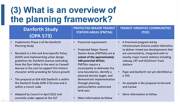
Okay, so you do need to provide a bit of context, much of the time. And this level of detail may be of interest to the decision maker in your organization. But will they read a slide that’s packed with information? They’ll expect you to speak to it, instead.
The context slide is typically where we provide way too much information, especially for a member of the public. Do they care about the ins-and-outs of what came before? No. A dogged opponent can find it in the planning report that’s going to Council. Someone with familiarity with planning policy can likely see how the pieces fit together. But for most people, you’re going to end up having to translate it verbally.
How would you explain the slide above? At a public meeting, you would probably say something like:
There are urban design guidelines that protect the historic character of this area.
New development is happening that should respect the guidelines.
A developer has appealed because it does not want to adhere to the guidelines.
This area includes a smaller area around the transit station that will be the focus of new development, because we want to encourage more people to take transit.
The provincial government’s policies for “transit oriented communities” may also apply to the area.
What would the average neighbour care about? That
development is happening, and
the City has guidelines to help retain the historic character of the area, although this is already being challenged by a developer, and
the City planning department is doing what it can to require the developer to integrate the guidelines.
Could you put that statement on a slide and speak to the bullet points above?
People are much more likely to think you know your stuff if you’re direct and to the point, rather than presenting an overly detailed information dump.
This is not the place to provide a full justification and every detail. It makes it harder for others to participate in the process; it makes it harder for you, too, to gain their trust and support. We seem to think we need to say everything there is to say on the slides themselves, even though this information is usually provided in the staff report or elsewhere.
People want to know what’s happening, and what to expect. You want to convey that you’re on it!
Too much detail:
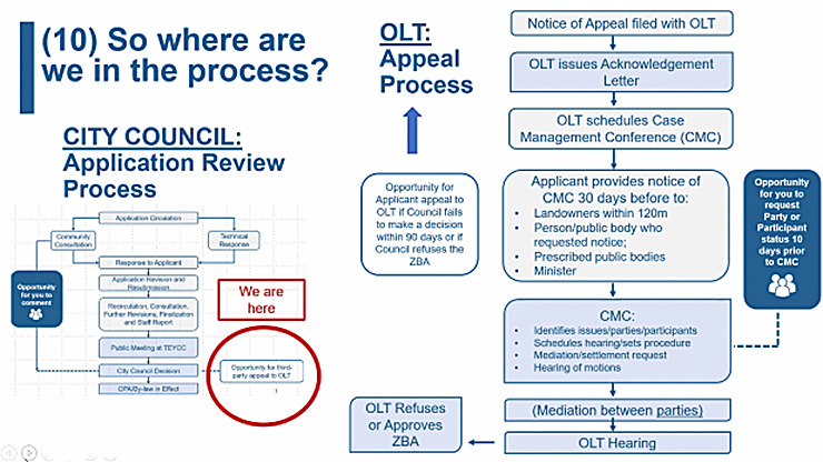
I always love a good graphic, but it has to be clear and concise to have value from the reader’s perspective.
A decision maker may be well-versed in the process shown above, and easily follow the flow. A member of the public will be overwhelmed. What’s important here? There is a “we are here” in red… does it mean we’re at the end of the process now? Is the flow chart on the right a close-up of the box in the red circle? The effort to clarify the process with a visual element is undermined by the volume of words (and boxes, among other things).
As the planner, you would probably explain this slide verbally as something like:
It’s been a long road; we’ve gone through the standard review process with this application.
Tonight we’re here to focus on the appeal process.
We’ve filed an appeal. You will receive a notice in the mail soon.
The notice will tell you how you can participate as a party to our appeal.
Here’s what you can expect from the process.
Do you get any of that at a glance? Because that’s what members of the community need. Most of us aren’t reading every word on a page (or screen).
Too bureaucratic:
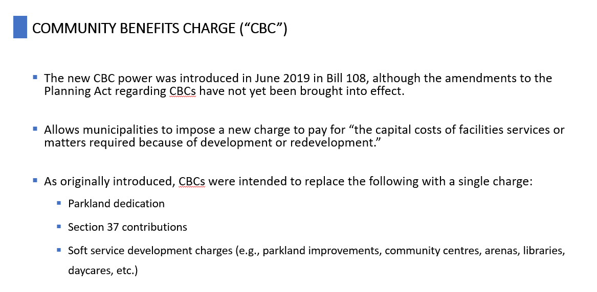
Senior staff and decision makers will be glad you provided a record of past decisions, but this isn’t the place for it. They have limited time and attention, like anyone else.
Your public audience doesn’t care about how you got to the conclusion, the process. Focus on the impact instead.
How would you explain this slide verbally? Probably by saying something like,
We’ve replaced our old mechanisms for generating fees from new development.
These fees cover the capital costs of new facilities and services that help to manage the impacts of greater density on a community.
It’s called the Community Benefits Charge.
Here’s why you need to know about it in this particular case.
Our decks can’t always cover the most exciting things, but even when you feel you must include descriptions like this for context, shorten the “what” and focus on why it matters, the “so what.” Add some visuals, like a photo, and get rid of most of the text. Do this by putting it into your own words, like you’re explaining it to your neighbour.
Slides should support your spoken words, not replace them!
A few ground rules
I can’t resist summing it up. Your role in preparing slide decks, most of the time, is to educate and inform. A decision maker may be more familiar with your work and have a larger vocabulary than the average person at a public meeting, but they’re each reading your slides because they want to understand, and usually, do something with the information. Make it easier for all of them.
If you do nothing else, keep the number of words down and speak to the detail. That means:
Focus on the “so what,” not the process.
Have only a few words and no more than a few lines on each slide. Embrace the white space.
Choose simpler, better words rather than technical terms – or if you must use them, add a graphic to illustrate it (but keep it simple, too) or provide a definition.
Use bullets. Much easier to scan and remember.
You can bend the rules of punctuation if it reduces visual clutter!
Keep it short. People want to learn, yes, but they also want to talk. Be prepared to listen, even though you’re the expert and have the first hand, in-depth knowledge.
Finally, proofread for spelling and grammar – don’t undermine your own credibility with careless mistakes!
If you find yourself verbally translating your slides for your audience, they’re probably too complex!


