Why are our Notice of Development signs just so bad?
Let's make it stop!
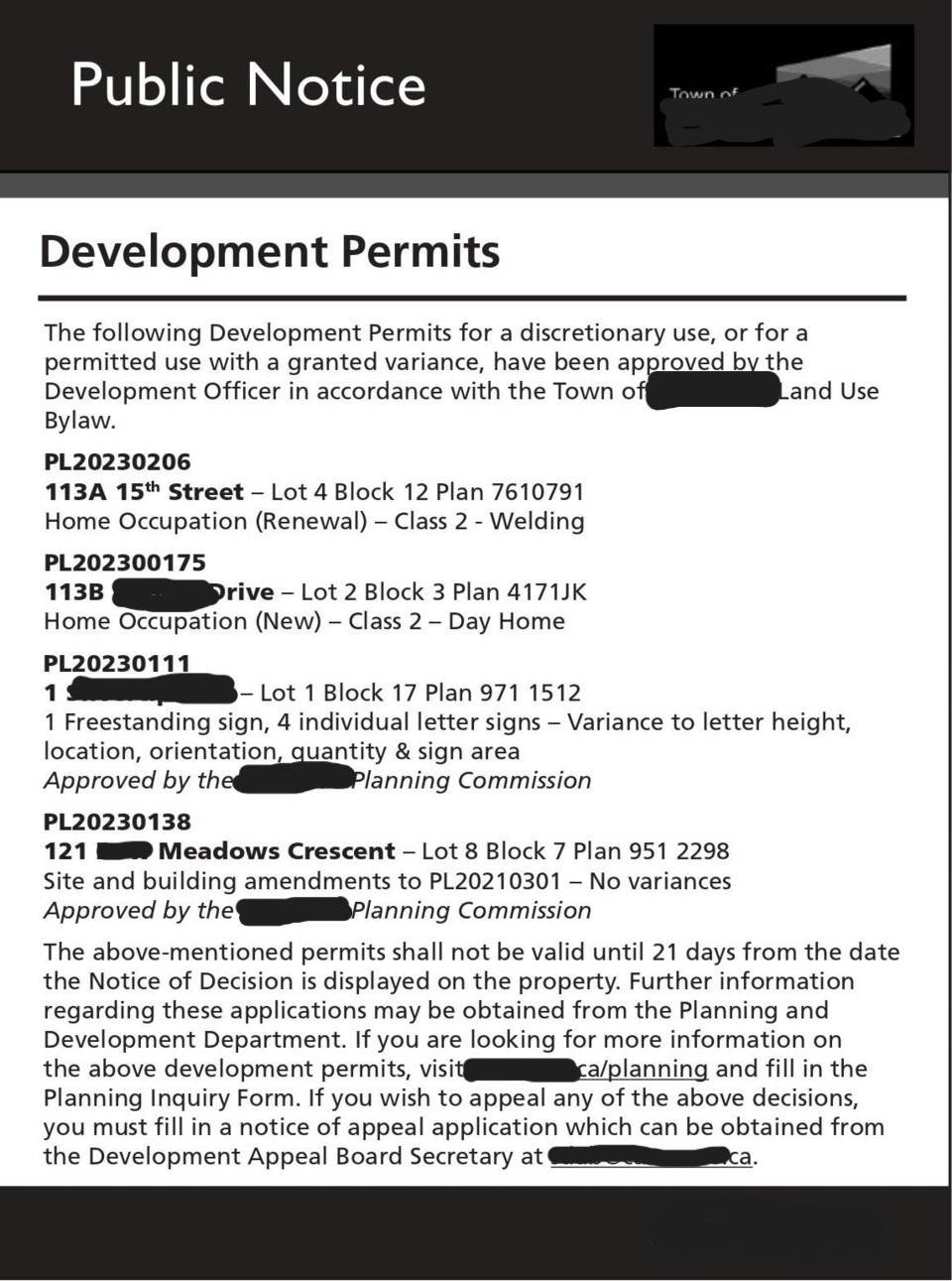
Why, oh why, are so many public development notices still so painfully bad? I am holding my head in my hands here, people.
Here’s what I’m talking about*:
Look familiar? To be sure, some communities do a much better job than others in communicating a change to a property or use. And many are considering how they can do better.
In the past, these signs were posted to meet a local government’s legal requirement to provide notice of certain changes to land use and development. They were also seen as an effective way to reach a lot of people with minimal cost (e.g., versus snail mail).
So what’s the problem? The problem is that the public expects to be able to find and understand the information they need to participate in the planning process. And let’s face it – these signs are way too much work. Pretend you’re not a planner for a moment. Would your read it all? Would you be able to understand it and take a step? Would you feel encouraged to participate? Would you understand why the project might matter to you and your community?
And let’s not forget: it’s your name on that sign. Wouldn’t you rather take calls and emails from informed citizens?
Here are the issues I see:
Dense, wordy blocks of text that the reader has to study
A lot of technical terms, acronyms, and jargon
No visual elements
Relevance to the reader is unclear
It’s not quick and easy to digest
Any others? Add them to the comments!
As civic organizer Dave Meslin pointed out in his TED Talk, if marketers were to write their ads the way we write our planning signs, they would look something like this:
Kind of like this public notice:
It’s an improvement on the first sign shown above, right? But there’s still room to make the proposal even more clear to the public. Things like:
A rendering, and colour, to show what the proposal would look like when built
A specific mention of what type of proposal it is (not just “Notice”)
Making the most important information to the reader stand out. For instance, wouldn’t they be more interested in where to go for more information (which is at the bottom) than who the applicant is?
Simplifying the language in the description (less jargon! Most people don’t know what area specific policies are)
Reorganizing the main text, like by using bullet points.
Why is it so difficult?
I can understand that there’s a hesitation to tackle legal language head-on for fear of omitting something that’s required or making a mistake. But even text that is required, that is complex, or technical, can be improved if the local government uses a “civic clarity” lens (see my post on July 5, 2023).
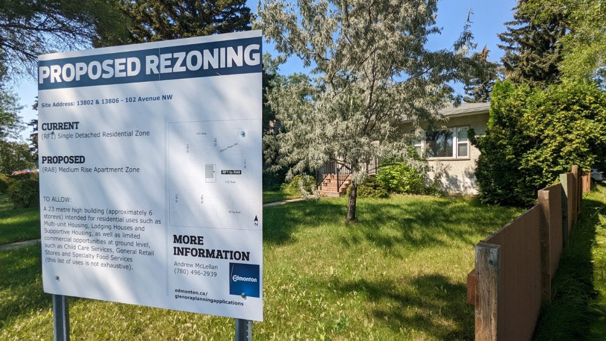
And we do get stuck with templates, and assume that they can’t be changed. Here’s a couple of examples where a new approach works really well, in Vancouver and Edmonton:
What makes them work? They put the needs of the public ahead of those of the local government!
Some governments are going even further. Look at Atlanta’s approach:
Take a good look at your notice of development signs. You may be more Vancouver than Atlanta; maybe you fall somewhere in between - or way outside. If you have some time, try redesigning your signs (Canva has a free version with lots of options). And a great resource is Design for Non-Designers, by Robin Williams. Feel free to share your approach in the comments!
The bottom line: A non-planner in the community who is walking by your sign must “get it” at a glance.
What you can do:
I really believe that as planners, part of our role involves advocating for changes that are needed to the planning process. When we see something that can be done better, we should speak up!
I know that the local government’s Clerk or legal staff are ultimately responsible for the content of our signs. But it’s our names on the signs – not usually theirs! People are calling the planner!
Why not talk to staff with the responsibility for designing your public notices?
Tell them what you see.
Share the improvements you’d like them to make.
Provide examples from other jurisdictions.
Attach a dollar figure if you can (for instance, what’s the value of all the time staff have to spend answering easy questions that could be answered in a clear and concise sign?).
Go back to key principles for civic clarity:
Identify your main readers (in this case, the public) and prioritize what they need to know to be able to take part.
Aim for a flowing, logical structure and organization of information. Put the most important information first.
Focus on the purpose of the sign. Is it just going up because it’s required, or do you want people to understand or do something specific, like show up at a public meeting?
Don’t forget the importance of visual elements to clarify or even replace the text!
Questions for members:
What are your favourite examples? I know you’ve got some! Some are downright hilarious (bad). Others are brilliant (good). Share them in the comments!
Have you been involved in a redesign of a public development notice? How was it done? What worked, and what didn’t? Is it a work in progress? What’s next?
Have you seen the short film Excluded by Design? It includes images of Toronto’s development notices by photographer Henry VanderSpek. I wish his work was on permanent display!
And a favour: If you’re finding this content useful, let me know that you like it, or tell me what info you’d like to see more of!
Next month: I’m going to focus on applied practice, like how to write a great planning report, emails that gets results, and more!
P.S. Did you see that the City of Winnipeg is making plain language a requirement for public-oriented communications? I can’t wait to see what they do with their signs!


